Organon (2012)

Organon was the title of a research project that I worked on while studying abroad at the Glasgow School of Art in 2012. Although I was admitted as a student of print and painting the individually directed format of the studio allowed me to experiment with a research-driven process. I eventually produced a manifesto and two house designs.

The idea of tools as a means to derive order from chaos traces to a greek word; organon. Equal in the definition were the connotations of sensory organ and thought structure. My research began to develop its own internal dogma around low technology, the merging of modern and traditional design languages, and permaculture (zero-waste gardening). There was an admiration of communal shelter from antiquity, and the manifesto engaged more and more with the overall goal of a system pertaining to a unit greater than a single person, and yet was not strongly imagined as a family structure, either.

When I returned to the united states, I applied to transfer to study architecture. The following years imposed their own microcosm of intensity and discipline, and swallowed by the spectacle of New York City, I lost sight of my original vision completely. But the critical framework of my organon research was never truly so buried. Design at one point became a sort of religion for me— representing the essential cosmology of what is humanly possible. I was driven by an interest in the real possibilities of cooperation, and the way that it could be monumentally expressed.

But finding out that the job in so many cases involves trampling some of the existing social fabric and period texture and universally abiding in the whims of the upper class left me bereft. I took some temporary solace in the artistry of drafting, both hand drawn and computer aided, but this was all unsatisfying as the realization dawned on me that I had become caught up in an idea of myself as an architect.

Originally, researching as an artist, I was subject to my own whims and explicitly defied the genealogy of architecture history and the current trade discourse, treating all things as equal in the formulation of a design language built around my niche interests like the amsterdam school and expressionist architecture. I realize now that I was working on an anti-modern project about consumption and obsolescence, but at the time I was proceeding along my own path of logic innocently.

The influence of the arts and crafts movement during my time in Scotland left me obsessed with the concept of a building being the direct footprint of the craftspeople who collectively built it. So my designs for country houses were taken partly from that tradition of William Morris; to have a cell of artisans housed together in self-sustenance, and for the building itself to feed into the loop. I was also bent on fusing divergent notions of architecture as organic and machine-like, by programming silos, wind-stacks and animal pens and bacterial digesters alongside human users as part of the positive feedback loop of shelter being proposed.

Forest Organon

The designs pick up where the texts of utopian catalogues and self-published designs of the 1970’s— authored both by hippies and ‘paper architects' left off, with a repository of “Low technology” that makes an easy link to traditional methods and forms. The designs adapt formal language from the machine aesthetic and the usonian school, contrasting the iconography of le corbusier with frank lloyd wright and bruce goff, to evoke the complex program of the building. Traditionalism in material and construction is decoupled from form, like thatch insulation under the stucco walls of the Narkomfin building). Like a strange mirror to Le Corbusier’s admiration of the grain silo, the organon house is a sort of machine mill for living. But just like mills were very function-driven constructs of their time, the approach for a house-as-mill did not call for stylistic historicism, but rather a kind of vernacular-driven, hand-built functionalism.

Prarie Organon

works on paper


About ten years ago I was making art thinking of myself as a painter. I was trained with oil paints by an intense and dogmatic teacher who was fanatical about one way of putting paint on canvas. Figurative art with direct decisive paint strokes and faceted gradations of observed color were the laws of painting I was taught, along with how to build and stretch a canvas, maintain brushes and handle the paint, thinning media and other arcane chemicals.

In the last few days before I went home for the summer, having finished and packaged my canvases, I dug up some tubes of gouache in a materials closet that I should have been cleaning. When I brought the tiny, rolled up tubes of paint to my teacher and asked to use them he wasn’t thrilled, but I had managed to replicate the pigments of my oil palette completely, which being his formulation couldn’t be argued with. I spent the last few sessions of class getting to know the paints while making two simple observed pieces on paper. I found that if I treated the gouache just as I had learned to use oils, with direct color from the tube & precise mixing on a large mirrored palette, simply using water to thin rather than laquer, they basically worked the same.

They don’t make an exactly comparable image, and there are lots of specific ways of working with either that don’t transfer, but my experience with paint to that point could all be nicely transitioned to a much smaller scale of work on paper. With the dynamics of mixing and opacity being roughly the same, almost everything else was different— shrunken and more delicate. I’m not sure why paintings made with water media tend to be smaller but I imagine that it’s mostly because of how quickly the paint dries, but it could also have to do with the sizes that watercolor paper is cut to. Brushes are scaled to fit smaller work and are much smaller than those for oil and acrylic, have very fine, supple bristles, which feel like they would do well to soak up and hold water. The differences between the two are mostly what have kept me using gouache more than a decade after painting in oils for the last time.

Without knowing exactly how to handle the paints at first, I would make a simple pencil sketch and then painstakingly mix local colors very slowly. In oil I had a rhythm for how my early washes & underpainting would dry and change in workability, but I found gouache dries almost immediately, unless it gets diluted to the point of being more like watercolor. So when I first tried using it, I didn’t try to build the painting up in much of a way, and instead just worked in mostly direct patches, like a paint by numbers.

Even though the size of these two paintings is much smaller than anything I made in oil they seemed to take more time. It felt like I was mixing a color for every tiny stroke. That wasn’t really the case, but it was how it seemed after a few hours of painting 2” square.

That’s why these paintings are left unfinished. There’s a scale factor to the time and physical size of the paintings that almost guarantees this format of skeletal drawing to give some indication of the space and then almost a swatch sample of the perfectly mixed observed colors on a small section of the image. If I had known what I was doing with the gouache I could have probably just as easily mixed enough to lay down color fields and make a proper painting, but this language of empty space and inferred texture is something I appreciated in its own right.


A year or two later, I found this way of working reemerge in montage. Here, where a the unpainted areas are a sort of ground, the collaged elements merge with the paint in an interesting figure with some dimension. This kind of image feels to me like it has one foot in the sketchbook and the other in a wire frame rendering.

This kind of speculative imagery encompasses both sketchbook fantasy and virtual reality. It still uses a sample set of colors to render out forms with surprising clarity. The image is nearly complete and almost insists on having some negative space as if to deny the stature of the kind of advertising illustration that it mimics.


Another year or so later, in 2013, I made a pair of mosaic paintings that worked like a multi-directional space-comic. Depending on which direction you read, the space of the painting can be explored on a few paths. Because of when I stopped working on the paintings, the further extents are represented more and more sparsely. There’s a quality of how a memory might look mapped out from the point of most vivid recall, out into more and more tangential and sparse elements.

amish 9-patch

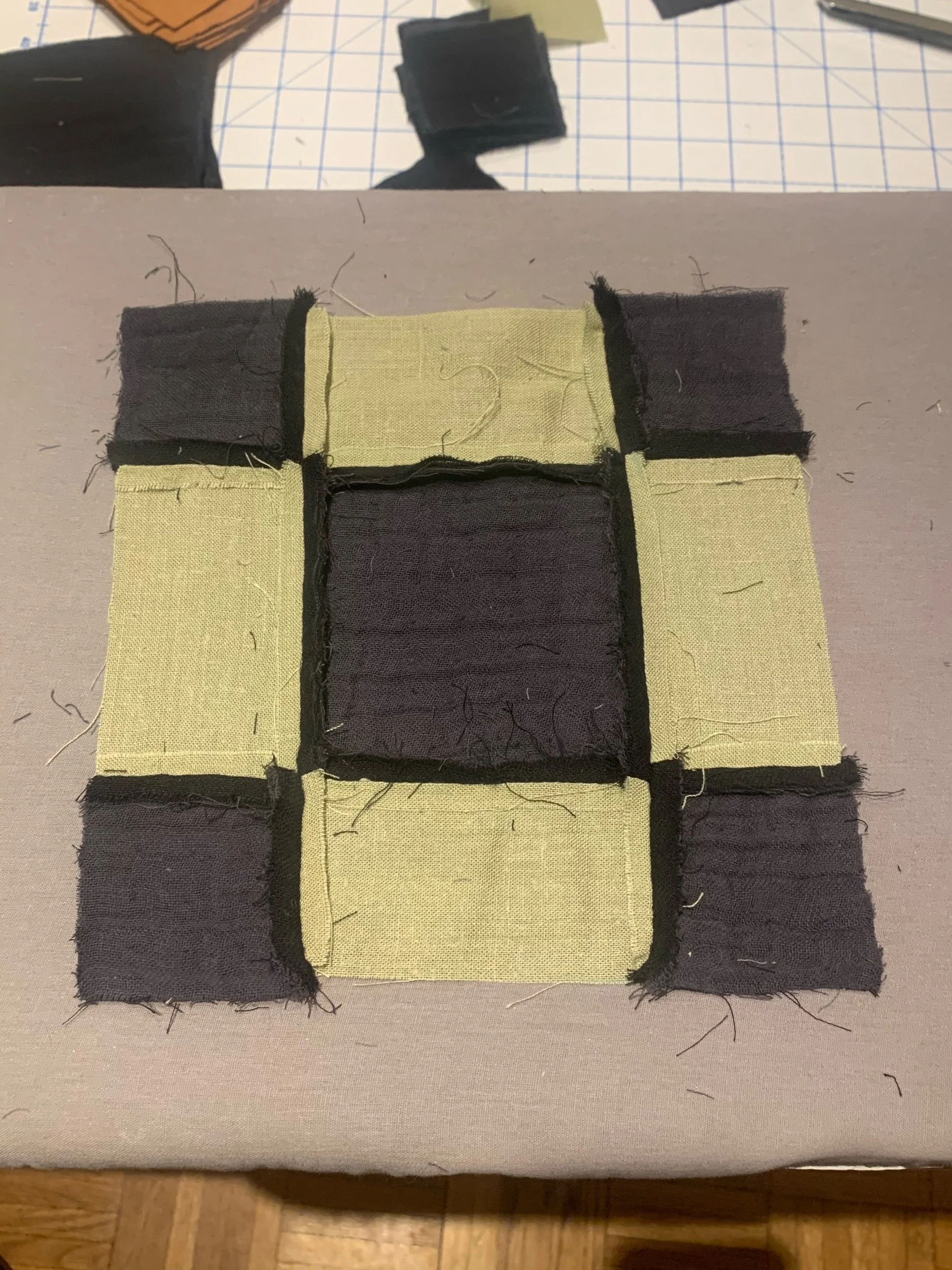
Over the winter I spent my idle hours learning the basics of quilting. I made a design for an Amish 9-patch, which can be as simple as a 3x3 grid of squares, but I played with the proportions a bit. When stitched, the small corner and side pieces join to make an inferred grid the same size as the center square. Despite the simple repetitive actions involved in quilting, it takes a lot of time to complete rows! It really is an antiquarian way of passing the time. I only got about half way done with one side of the quilt by the time the thaw came. Next year!

a year of unrealized designs

quail coop

April 2020

When I built my raised garden beds two summers ago, I had also recently given up on a tandem project of raising quail. I designed a coop sized for 6-8 hens if I remember correctly. The doors (painted green) are meant to hinge open, the lower ones are for collecting eggs from along the sloped floor. The style of the cabin of the coop was made to complement the house it would adjoin, while it was also meant to partner up with the garden beds.


yarn caddy

December 2020

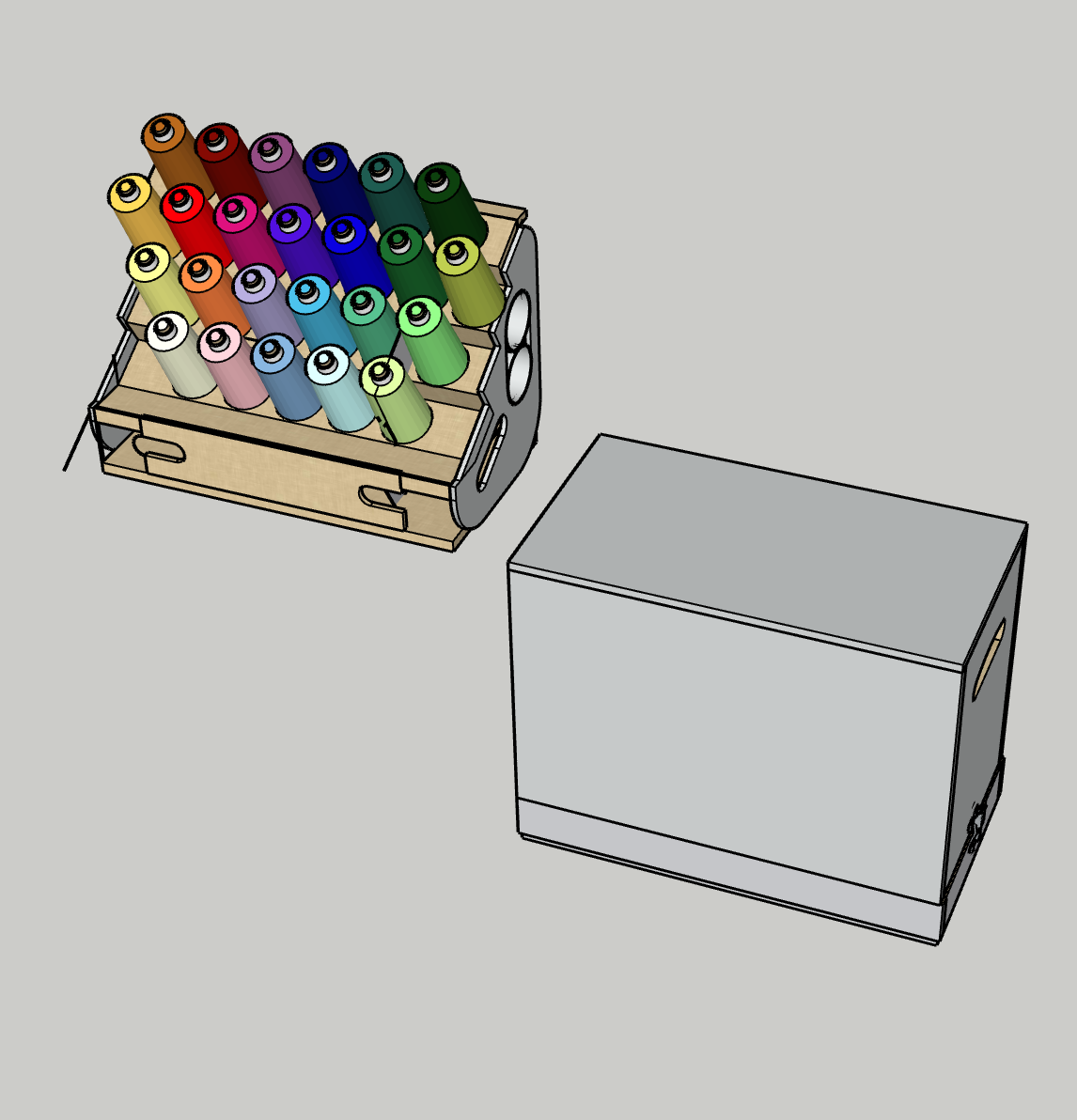
When I made my sewing table I also designed a set of crates for each of my sewing machines. They each fit in a tray sized to their beds, and then each had a corresponding case with handles which connected using latch hardware. The case size varied according to the size of the tray, so that all the crates were the same overall dimensions.

One of my sewing machines does a kind of embroidery stitch, and uses a particular type of yarnlike thread. I have 25 rolls of this ‘tex 15’, and they roughly form a color space when arrayed with some care. I tried a couple variations on how I could display the colors and also keep to the standard overall size of my other crates.


wacom desk

January 2021

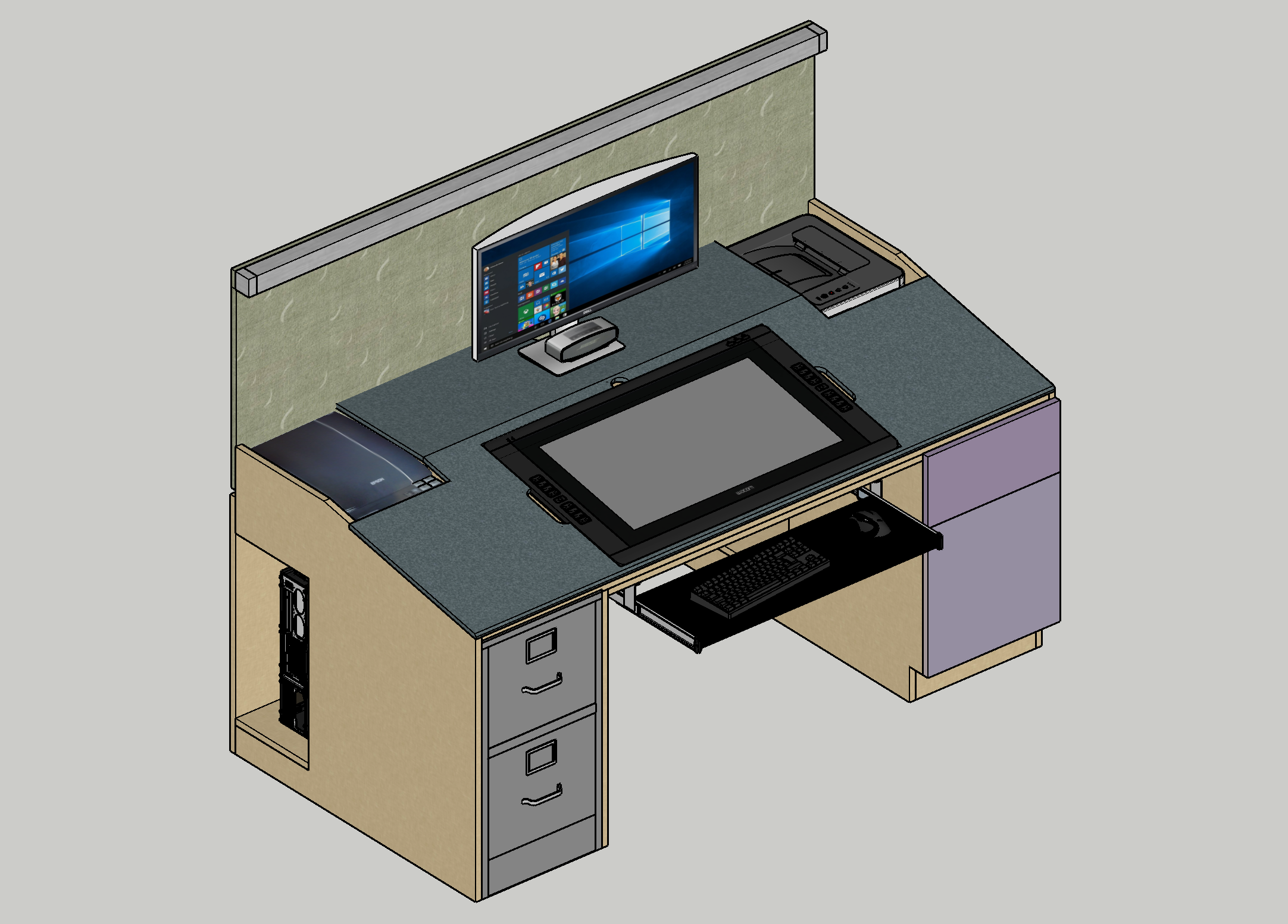
I have a wacom tablet from about ten years ago that sits on an adjustable stand, meant to tilt like a drafting table. It also turns on a radius at the center of the screen to almost any angle. The problem with the stand though is that when placed on the desk I found the screen was always a bit higher than I felt comfortable drawing on. Being from 2012, the screen itself is four or five inches thick at the center. It was always above where I felt the desk ‘should’ be (and was), no matter what angle i set it at.

I worked for a couple weeks attempting to make a desk that could swallow the tablet and make the two surfaces basically flush. The desk itself began with a design in James Hennessey’s book of DIY furniture “Nomadic Furniture”, designed to use just two 4’x8’ sheets of plywood in an interlocking, fastener-free joinery system. From there the design evolved a bit, first to slope at a set angle, then an adjustable one, and finally to allow the tablet the ability to rotate on a lazy susan, with a screw tightened brake.


cat sheds

March 2021

During the covid lockdowns I spent a lot of time living among and observing our new kittens. They’re the first I’ve ever really gotten to know, with attitudes and personalities that seemed to be there from the start.

Tony, the more aggressive cat would usually be the instigator, stalking Maria and pouncing and chasing her. Maria is more of a comfort-cat and is not as high energy, she always seemed like she was putting up with Tony’s excitement and humoring him until he became too vicious. We wondered if their names were deliberate, because Tony was usually bent on pursuing Maria.

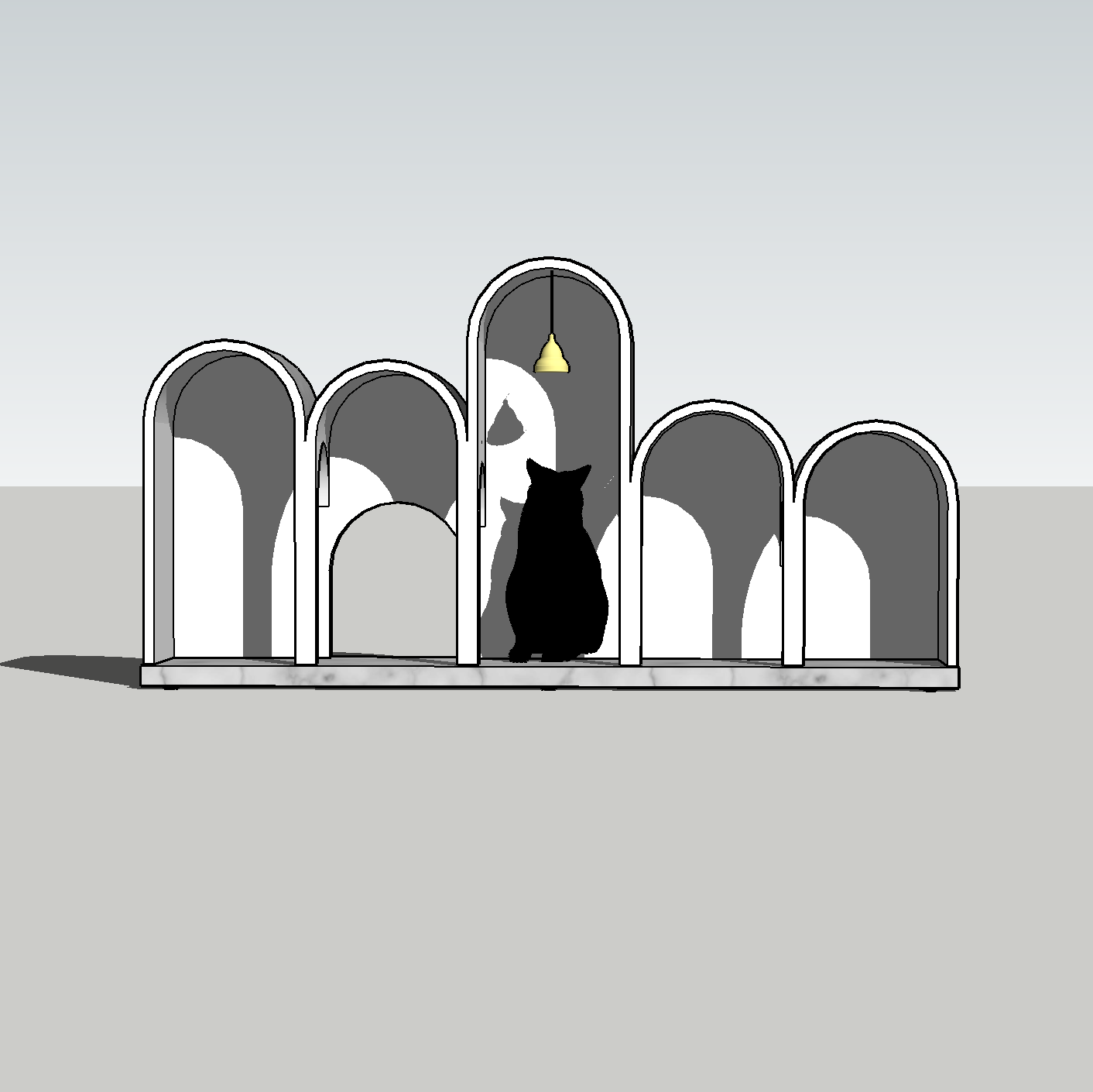
I’m not sure what first caused me to think of designing play structures for the cats. It wasn’t in keeping with my project from college for dogs, but more along the lines of interesting and strange furniture.

The line of thinking here is a little weird. We had a couple carpet-clad towers and tubes for the cats to play on and they seemed to me like a strange kind of brutalist form. Carpet-brutalist. There was equally something scratching at the back of my mind that I had read somewhere in design theory, someone from the streamline era like maybe Raymond Loewy had said that the basic form of cars is derived from the sphinx, a strange prone homunculous of a forward oriented face and 4 wheel appendages. This got me thinking about my cats as little vehicles, in relation to their furniture scale play structures, which in my covid shut-in fervor seemed like little buildings. And thinking of little buildings pertaining to vehicles as their users, I thought of the roadside architecture of the 50s and 60s.

So at approximately the intersection of these two thoughts came the idea of “cat sheds”, as in decorated sheds for cat traffic. The first is based largely on the Chips restaurant in Hawthorne California, designed by Harry Harrison in 1957, and the other is an adaptation of a bus stop in Shymkent, Kazakhstan, designed by an anonymous state architect in the 1970s. They each feel proportionate to the different characters of the cats that I’ve come to know too, one a riff on the prowling inherent to “cruising the strip” and the other a humble monument to the braced and waiting.